Menu Template:
DHTML Flyout Menu Light Blue Toolbars |  |  |  |  |
Rotating Flash Menu For Websites
This menu is generated by Vista Flash Menu.
Create your own menu now!

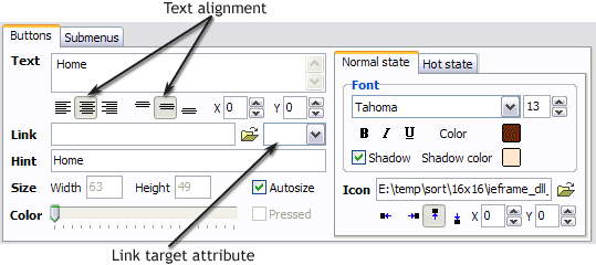
 Text - type the button text here. If you want the button to have several lines of text just press "Enter" after typing each line.
Text alignment - defines text alignment inside the button.


Text offset - text offset in relative coordinates. For more precise text position adjustment.
Link - the link that is to be opened when user clicks the button. For example: http://www.vista-buttons.com. You can also click "Open" icon to the left of the "Link" field to select the page you want to link to.
Link target attribute - link behavior adjustment. Link target attribute tells web-browser where to open the linked page. This attribute represents the Target attribute of the link (<a> tag in HTML). You can either enter your target value in the field or choose from the predefined attribute values in the list.
If you enter your own value, it must be a window or a frame name. Note, that names are case-sensitive. The linked document will then be opened in that window/frame.
Predefined attribute values:
_blank - Browser creates a new window for the linked page.
_parent - Linked page replaces the current frame's framesetting page (if one exists; otherwise, it acts like _self).
_self - Linked page replaces the current page in its window or frame.
_top - Linked page is to occupy the entire browser window, replacing any and all framesets that may be loaded (acts like _self if there are no framesets defined in the window)
If you leave the field clean then the linked page will be opened in the same browser window.
Hint - specifies the tooltip that is shown when you hold the mouse over the button for a few seconds.
Autosize - defines whether the button size is set automatically to accommodate all its contents or not. If not, you should enter the button size manually in the "Width" and "Height" fields.
Width, Height - if "Autosize" property is off then you can enter the button size in these fields.
Pressed - this property is disabled unless your menu type is "3-state toggle". If the menu type is "3-state toggle" and the property is set then the button will be displayed as pressed. Note, that only one button in the menu can be "pressed" at a time.
In the example below, the "Download" web page buttons Pressed property is set.

Color - move slider to change selected buttons' colors.
 (please include template name in the message title)